I am still trying to work out a style for my artwork which isn’t an illustration. I’m not a great fan of the photorealistic gouache landscapes, portraits, strawberries, watering cans and other such subjects, much as I admire the execution and skill involved. For me, I like the medium to do some of the talking, and while I like the flat blocks of colour I use with the bird illustrations, if I am tackling something more creative, I want to see that it is drawn or painted or printed.
I wanted to try a composite birds painting so used my Fabriano sketchbook in case I needed to scrub things out and rework them; the paper is very forgiving. I took some screenshots from the Polish bird table webcam and placed them together on the page. I kept to a very stylised bird painting so no shading or complicated detail, but I did want to do a background and have them in a context.
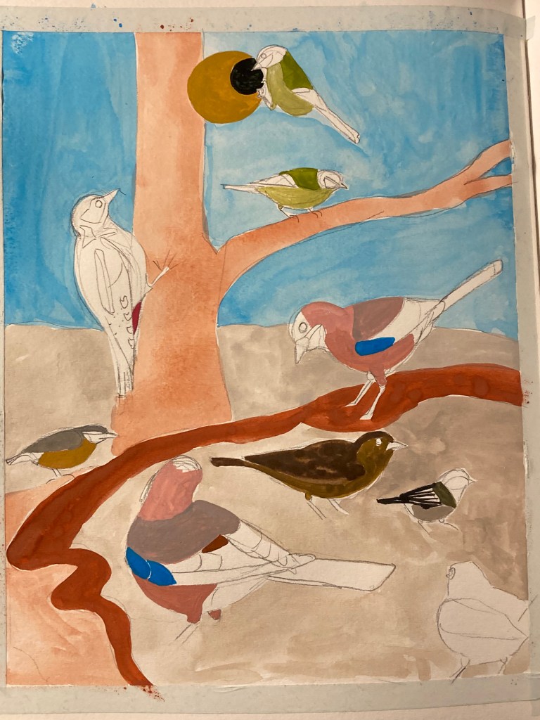
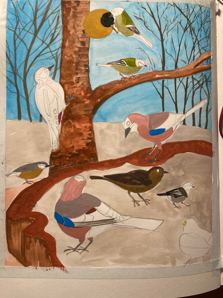
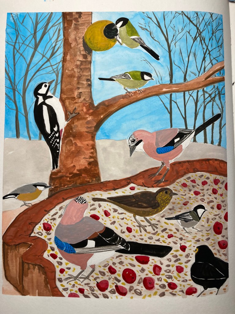
I really liked doing it, and I like the naive quality of it. I want to have another go and also see how I feel about it in the next day or two. I think it’s very “me” and in keeping with my style but with a bit extra. What do you think?
Having made my resolution to use up my leftover paint, I started my Leuchtturm sketchbook. So the idea is to not use any extra paint, and to improvise with the leftover colours I have in my palette. I had a blob of black left and I thought I might save that for next time but I realised it had some blue in it, so I did a quick sketch of my [black] cat at the end, hence the rather odd addition in corner compared to all the colour in the other sketches. These were also from the Rwanda article I mentioned before.
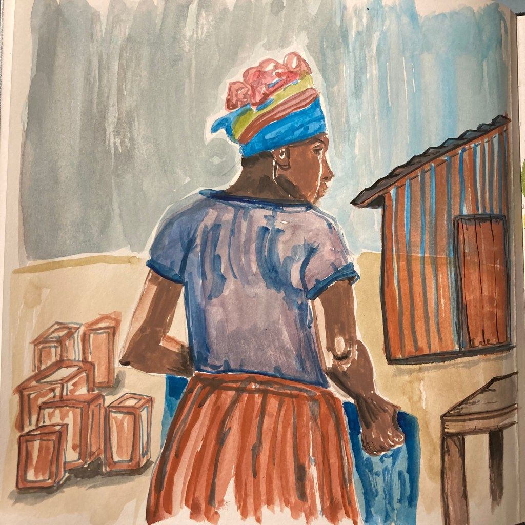
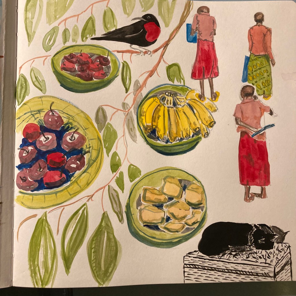
The paper in the sketchbook is really nice, even though I think it is probably mainly for ink and pencil. It has puckered slightly but I don’t mind. As you can see, I overestimated the amount of olive green I would need for the Great Tits so I added additional leaves behind the Sunbird. It’s really fun to do though, and great for practising as I have to find a picture to use that will fit with the paint, not what I would normally choose. The lady at market on the left is wearing a stunning array of fabrics and patterns in the photo so I feel bad for dressing her in muddy burnt sienna and ultramarine. Needless to say she is also far more beautiful/less stern in reality too but the fact I’m even tackling people is quite a thing. I’ve done life drawing and sketched people when I’m out and about, but have always kept things very loose and gestural, so never tried painting someone. I am finding that Black skin is really interesting to paint as there are so many more tonal values and I feel much more comfortable with umber, sienna and ochre with their warm notes rather than finding my way around the greys, pinks and peaches that cool-toned white skin requires.


I think the painting of the ‘birds in a context’ is an excellent development of your painting style. A happy compromise between stylistic and realistic. Looking forward to more: seashore, lake/river, woodland. Go for it! A good start to the New Year.
LikeLiked by 1 person
Thanks Ma! 🙂
LikeLike
Jen, A happy new year to you and that work is super, really inspirational paintings and images. John
LikeLiked by 1 person
Thanks so much, John! And a HNY to you and yours too 🙂
LikeLike