

I love lettering, both to look at, use in my work, as well as drawing the letters themselves. I am not terribly accurate in that when I am doing words for an art project, I don’t measure or use any sort of grid, and for some reason I find it very difficult to spell correctly when I am drawing one letter at a time.
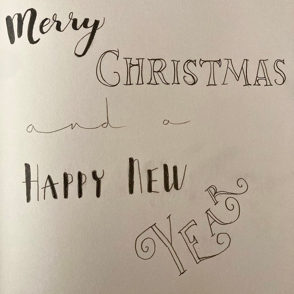
I tend to use Pinterest for inspiration, although I have some books on type, and I also have printouts of any good ones I find. Pencil calligraphy is great as it allows for adjustment, and the graphite gives a nice sheen. There is no need to actually ‘write’ the lettering as there is no way of getting any sort of flow that you would with handwriting; this is a different skill so copying the letters and their individual forms is the same as copying anything else. One thing to be aware of is the ligatures (joins between letters) can alter the structure of how the word is put together and look very different to an alphabet, so you can play around with this to make it work in the space.
If you want to create your own traceable lettering, it’s quite simple on any word processing software (but even more so on a graphic design package such as Adobe). On a new page, make a text box, write your words in a fancy font, and add a border to your letters. Make the outline at least 1pt, and the text fill white. You can space the letters to make it easier to read. Then, flip it horizontally and then print it off, write over the letters in pencil, then turn it over and trace over the letters again and there you have your pencil imprint of the font.
Hand lettering is a good way to practise pencil control, and the quirks of layout are all part of the charm so there’s no need to get hung up on accuracy.


I used to have – although I say so myself – quite good handwriting once upon a time but years of using computers have put paid to that.
I used to “design” words (or try to) so that they looked the same if turned through 180°, sometimes with great results in a Roger Dean-ish sort of way, and sometimes no so great but the point of it all was simply doing it I think, having a go.
Once in the digital realm, in the early 1980’s with my trusty Sinclair ZX Spectrum, I made a fairly good stab at an “Old English” style font which could be displayed on the TV when using the dear old Spectrum. No mean feat as each character had a grid of only 8 x 8 pixels and there was no GUI as such, each character had to be rendered as a grid of ones and zeros.
Skip forward a few decades and I now have FontCreator from High-Logic (other font creation programs are available) and have spent probably far too many hours designing (messing about with) fonts just for the sheer heck of it.
LikeLiked by 1 person
That all sounds huge fun! I’m definitely more a pencil and paper kinda gal but I’d love to utilise the Adobe programs more.
LikeLiked by 1 person