A couple of weeks ago I had a fantastic day at New North Press learning about letterpress. I love type, printing blocks, paper…the whole thing, and I was excited to have a go at something that has fascinated me for a long time.
I arrived at the studio and was greeted by Klara who was our tutor for the day. I met Matt and Marie, the other attendees and we introduced ourselves over a cafetière. The studio was heavenly. The smell! All those letters!!
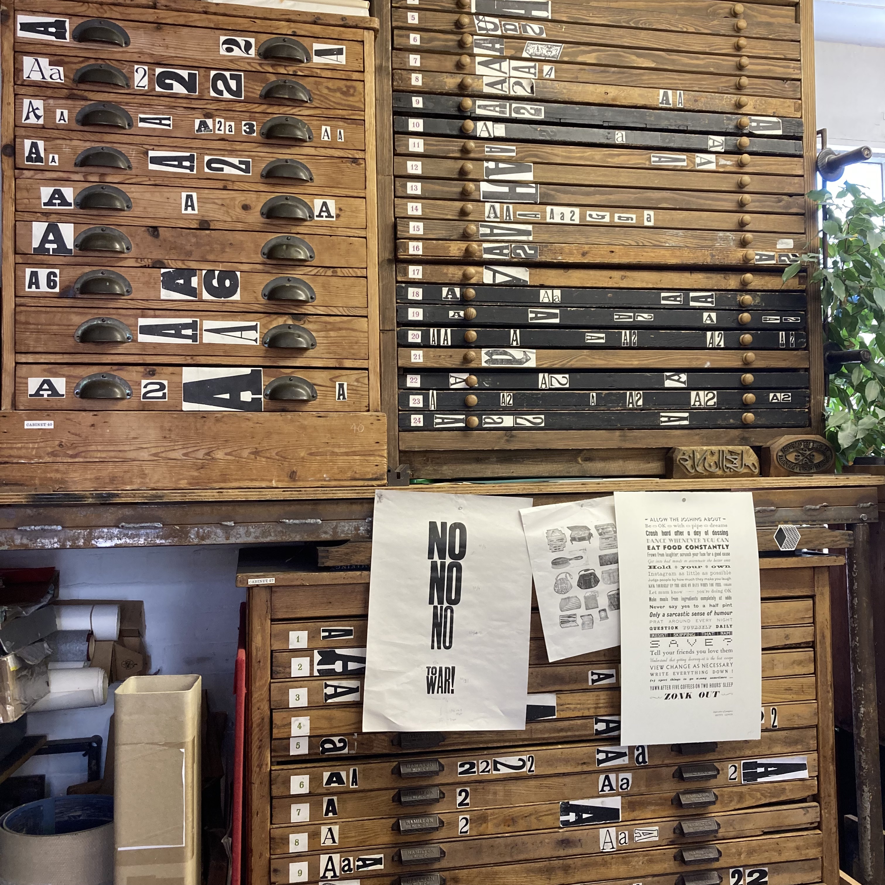
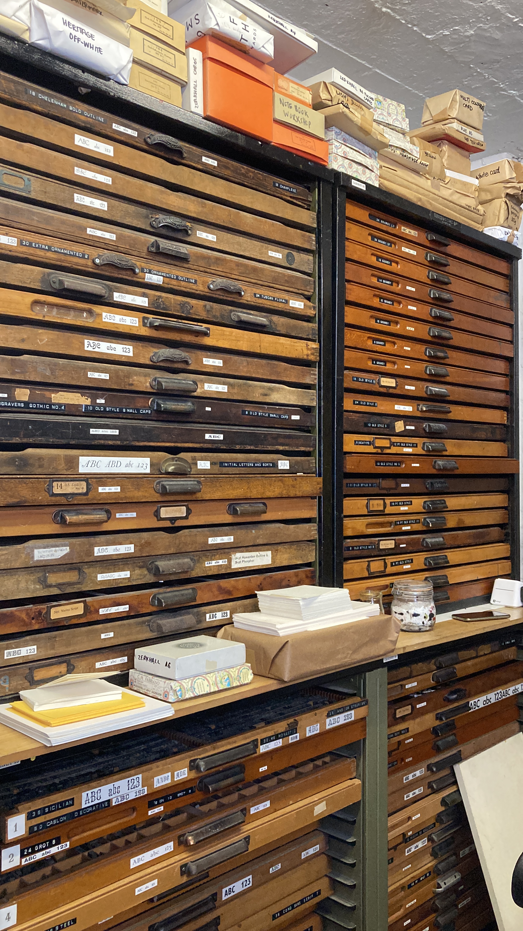
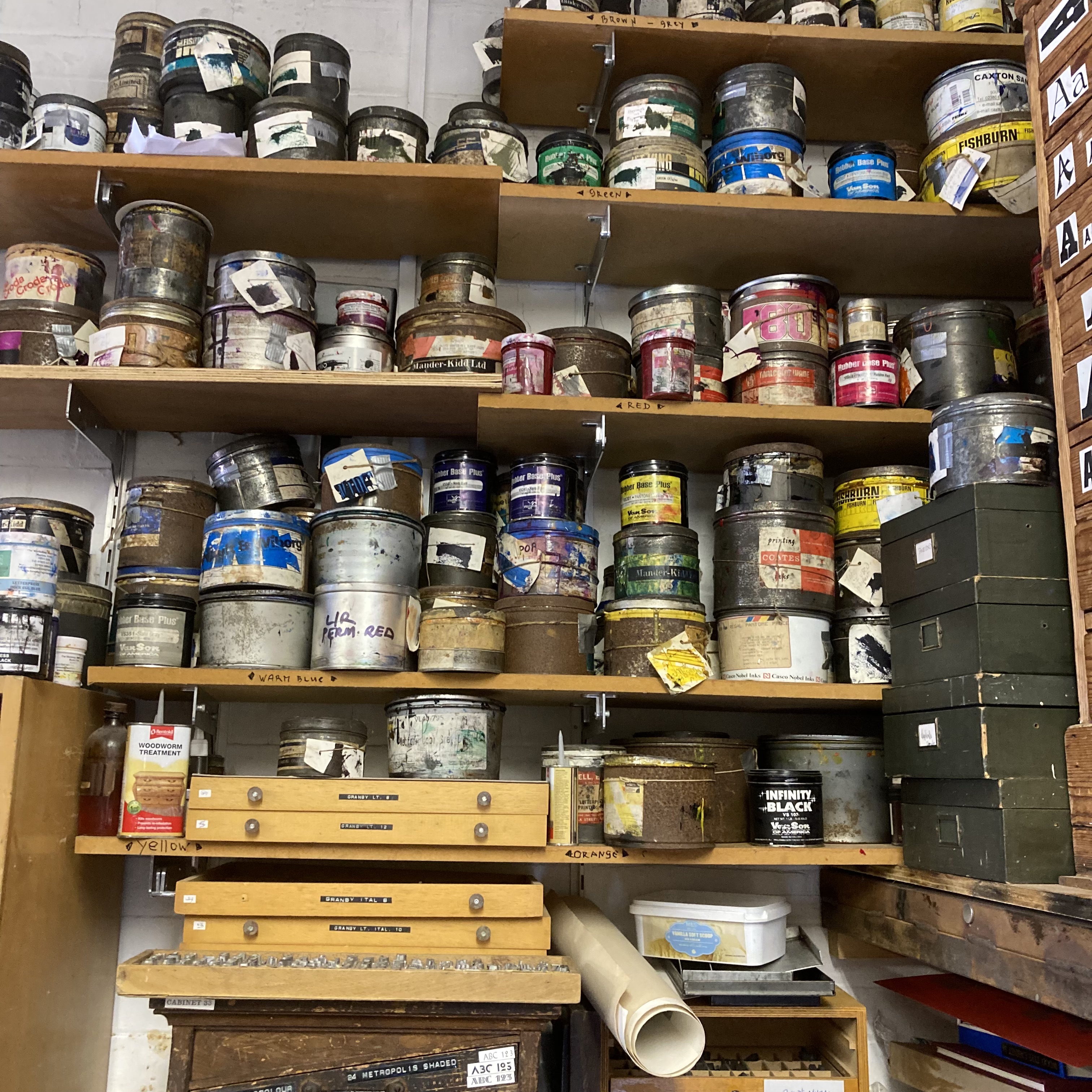
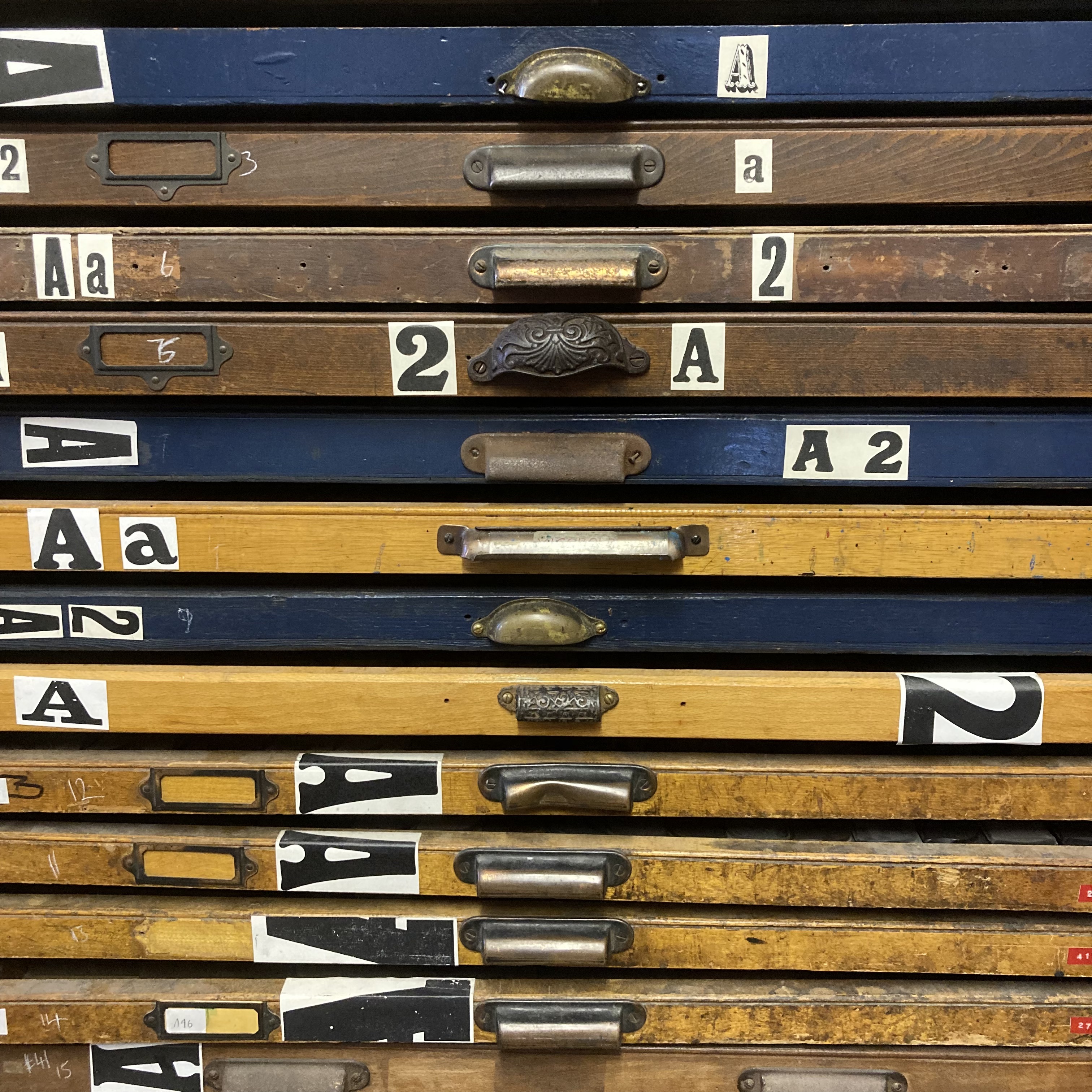
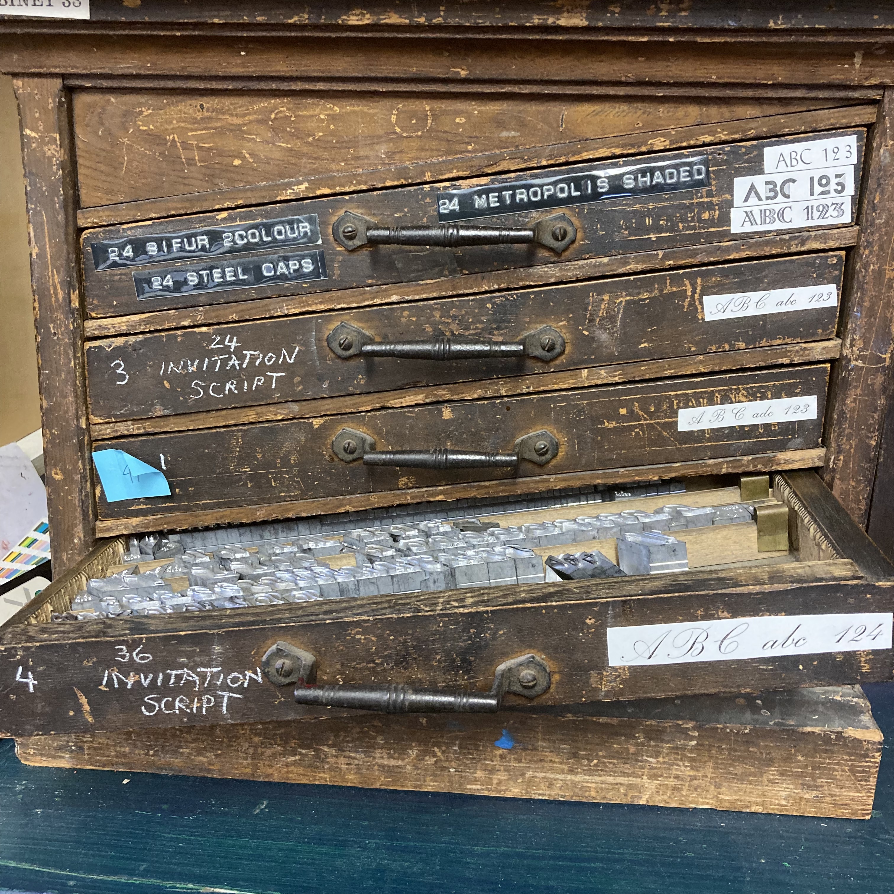
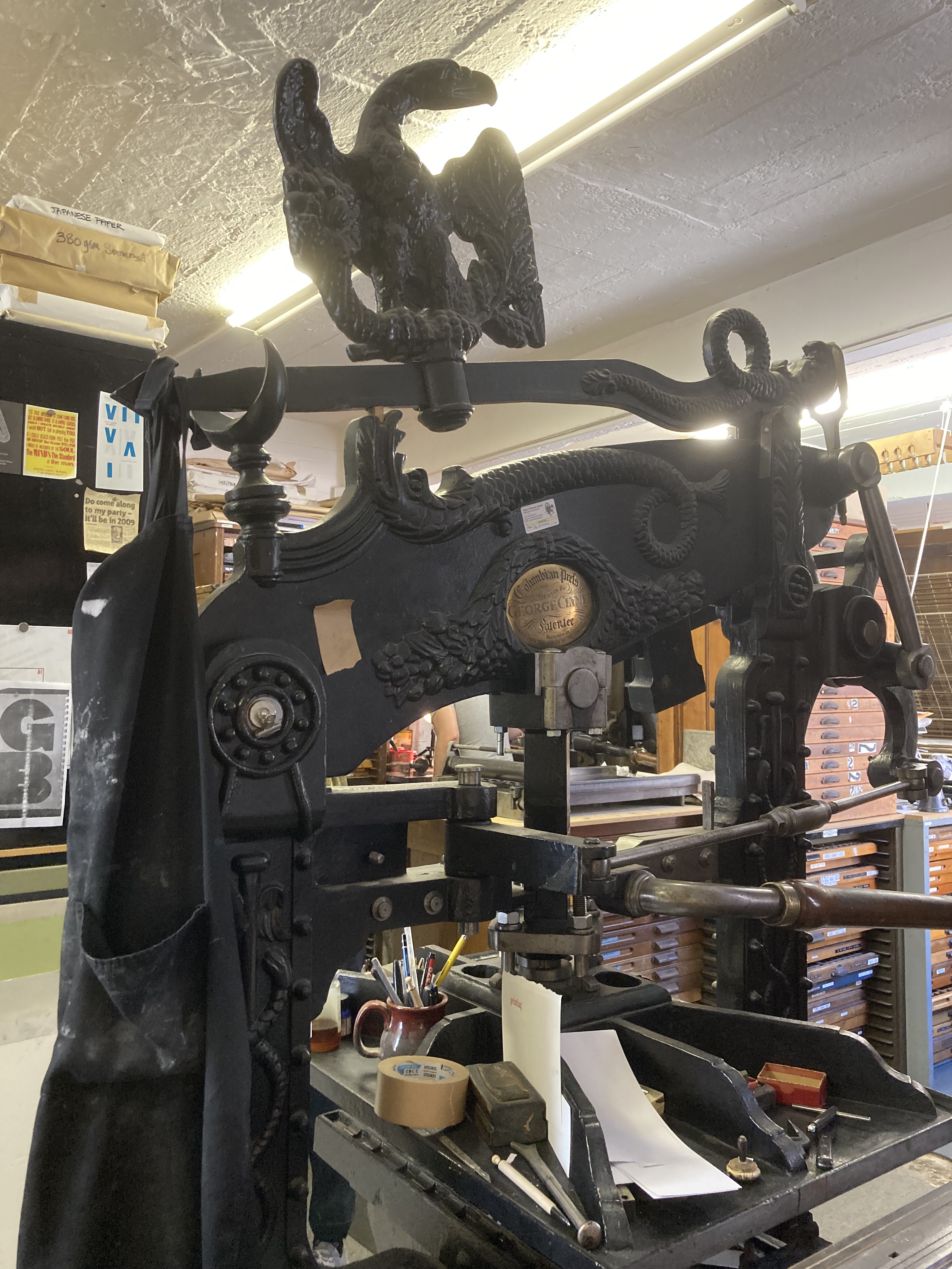
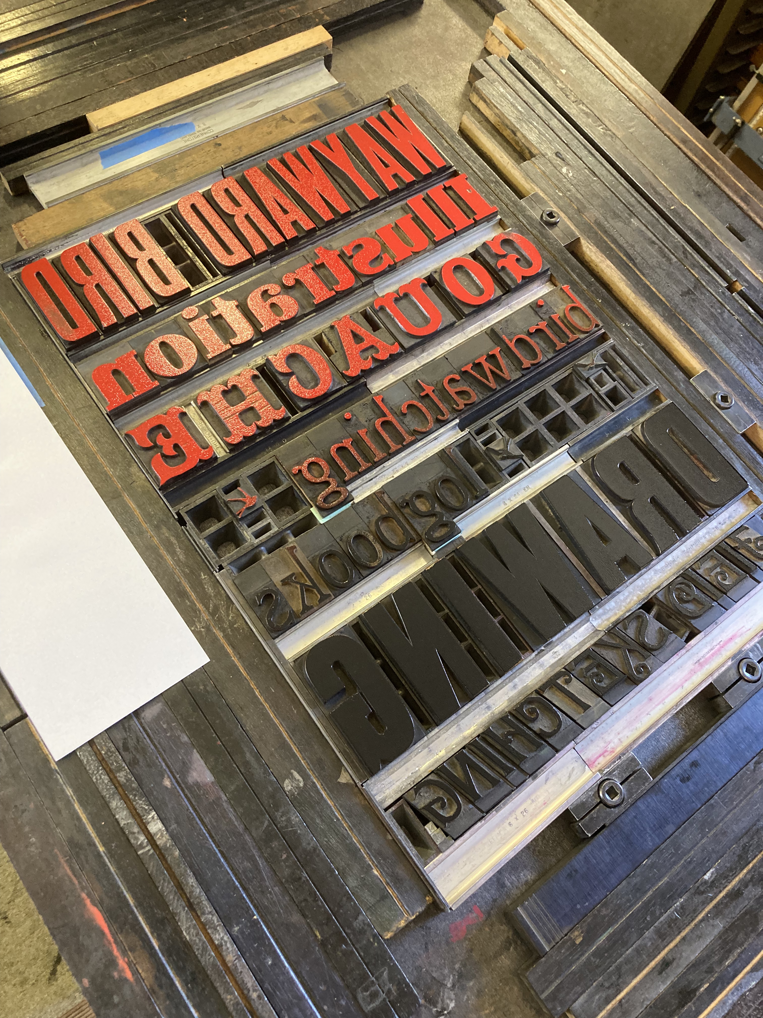
We started by discussing the types of lettering and the processes involved. There are a vast array of letters, and working out which one to use for each word was a very pleasant way to spend the first part of the course. Not all the typefaces have enough of the required letters to spell the words and it involves a great deal of mental juggling to make sure they will fit on the gutter – which is a bit like a baking tray where you arrange the letters. There is also a fair bit of maths. I know from doing the logbooks that sometimes what is technically precise just looks imbalanced; letter spacings between two l’s or an A and a W, or two o’s need to be adjusted according to how they look, not how they measure.
I had the idea to produce a poster with all the things I did as part of my business. Working backwards and upside down took a bit of getting used to but after a while you get your eye in. We did a test print to see how about spacing and to make sure I was “minding my P’s and Q’s” – where the expression comes from as of course they are easy to muddle up.
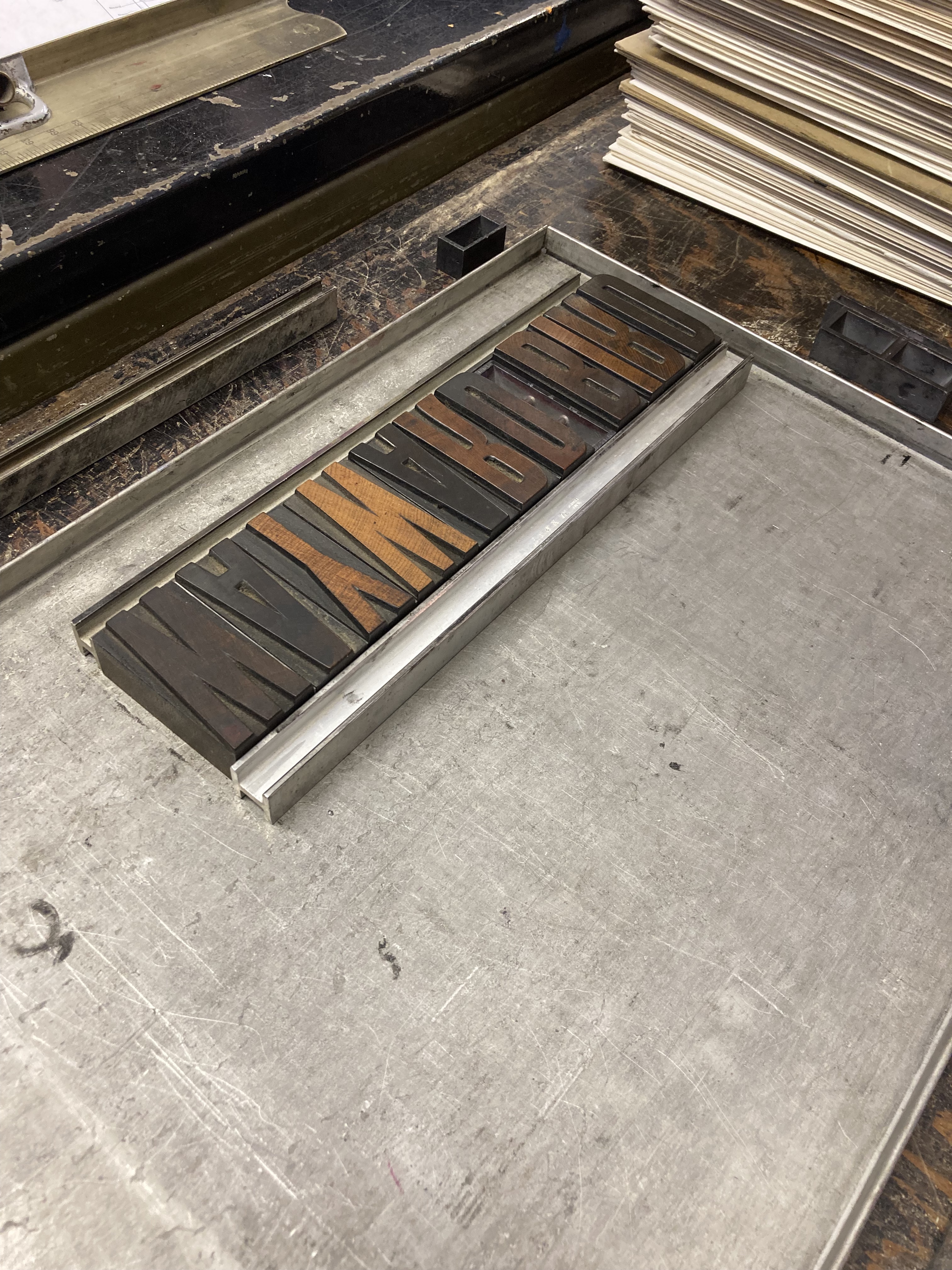
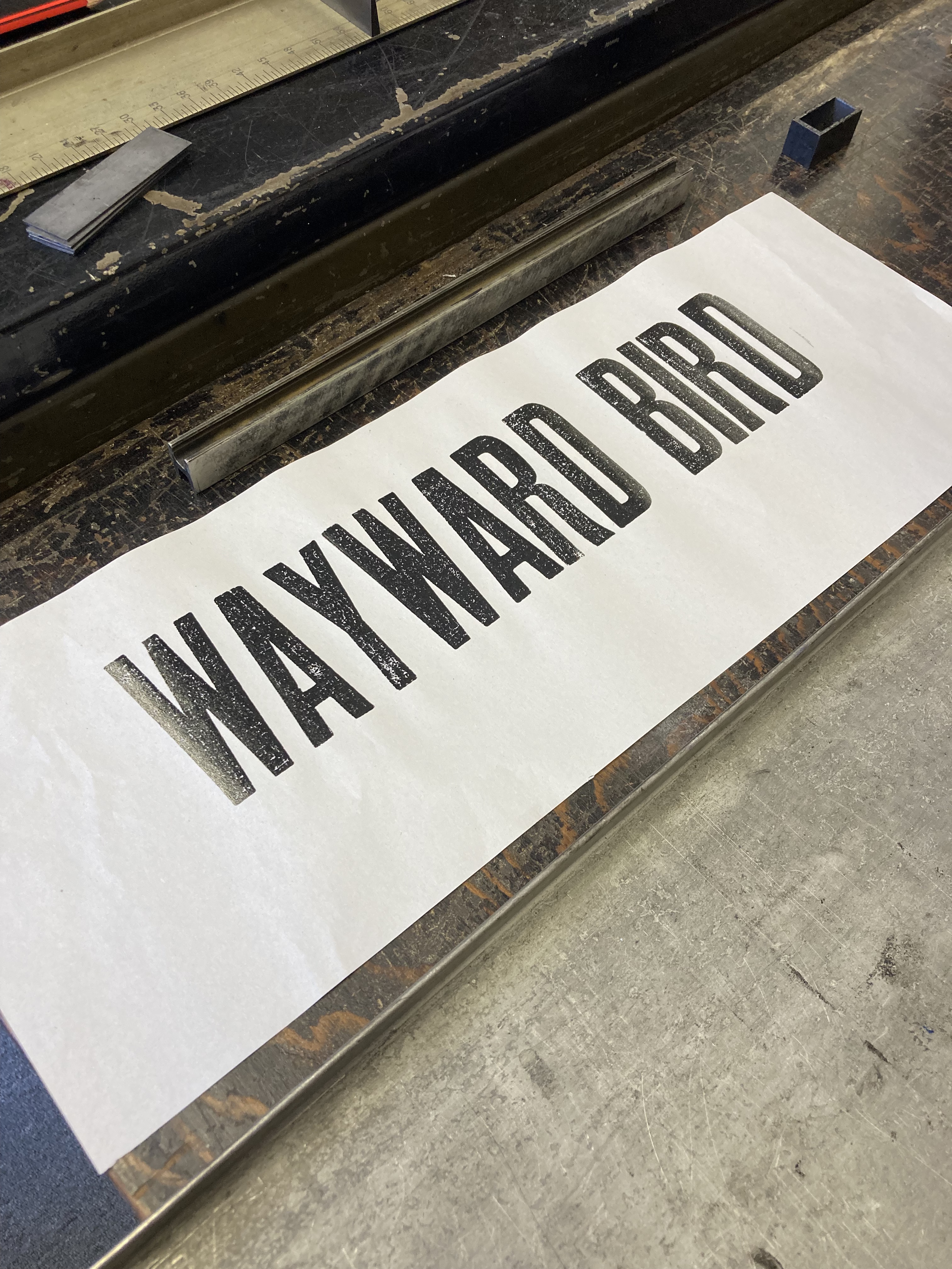
All good! I got to work preparing the rest of the words.
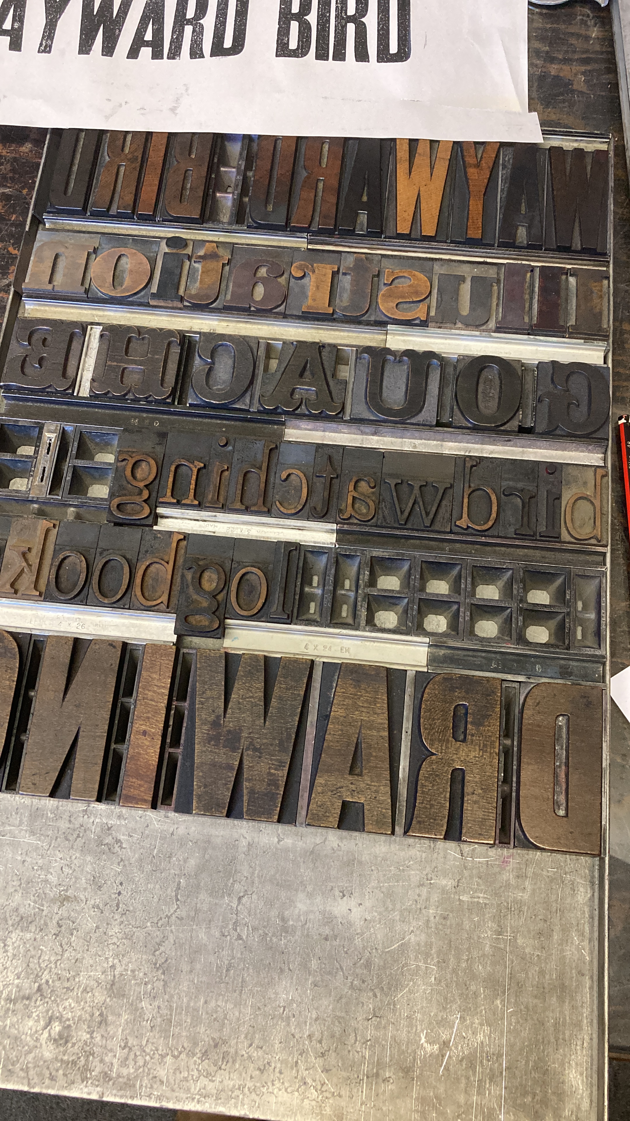
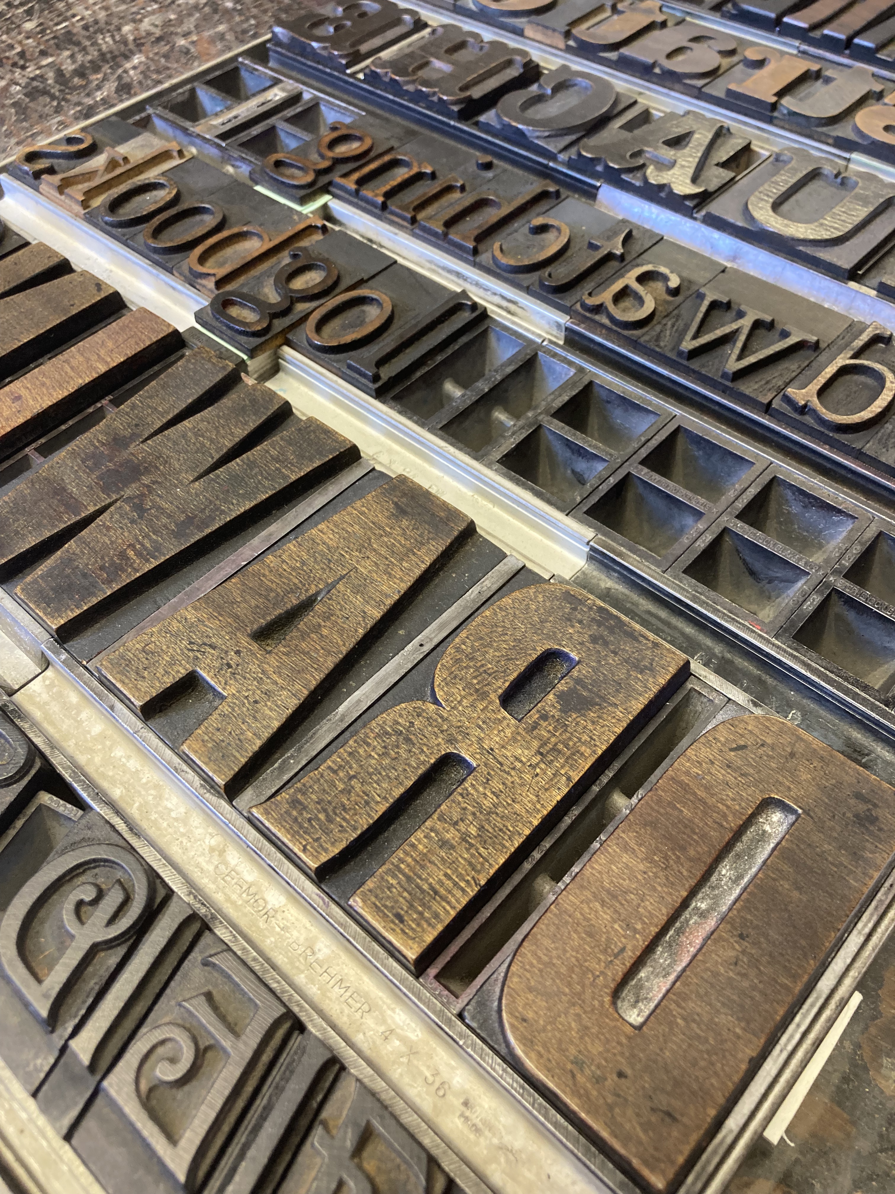
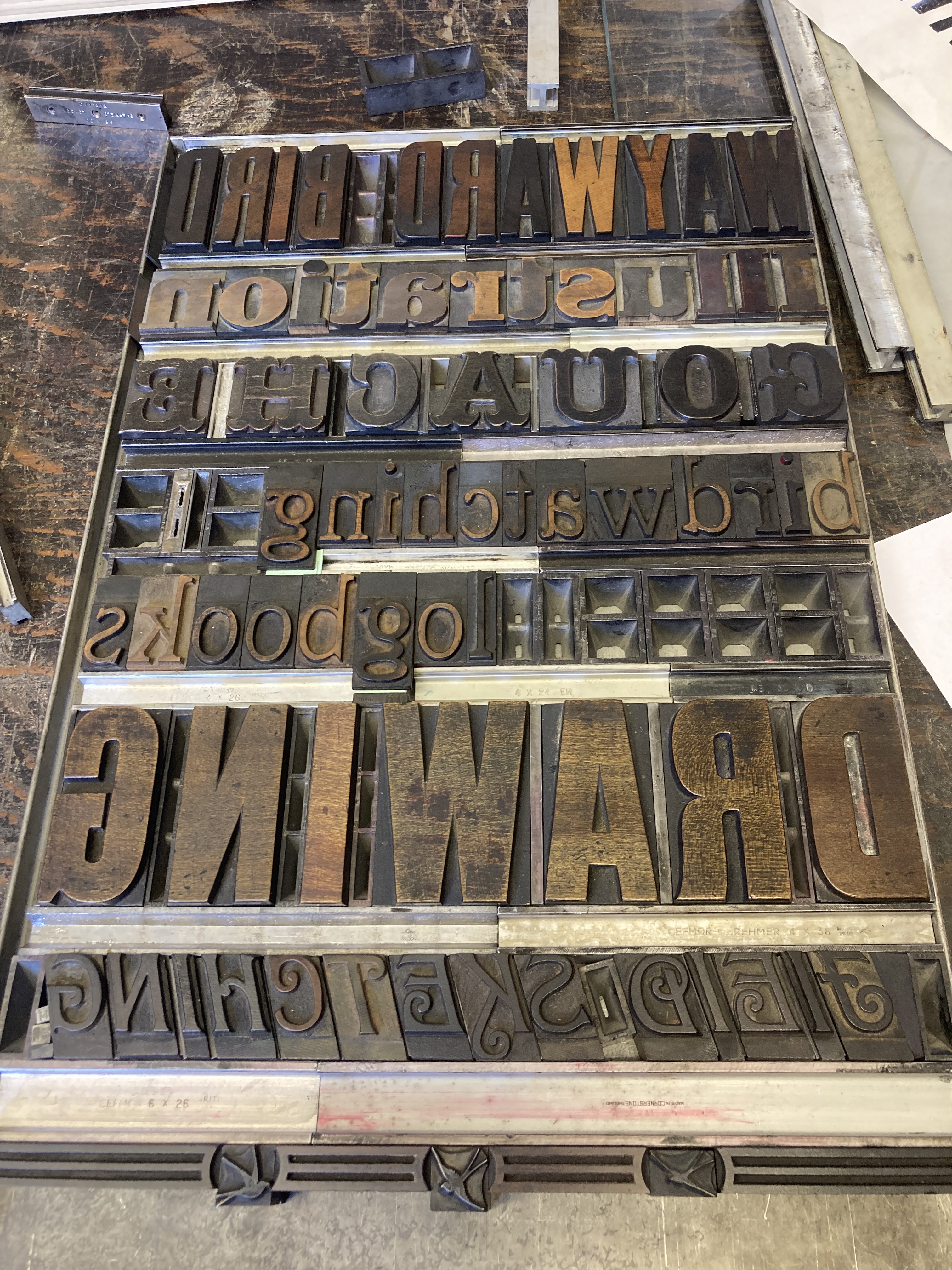
I experimented with various different designs – remembering to keep the whole set up firmly contained within the sides of the gutter. It’s easy to forget that blank space is filled with spacers (quads) so doesn’t look blank; I added in some little Swallows that I found to break up the emptiness around ‘birdwatching logbooks’.
Then, on to printing. I transferred the blocks on to the bed of the press, and used wooden furniture to compress the letters just enough to keep them contained. I wanted a gradient from red to black, so using a roller that spanned the length of my lettering, I rolled through the red and black to coat the roller, then applied the ink to the blocks.
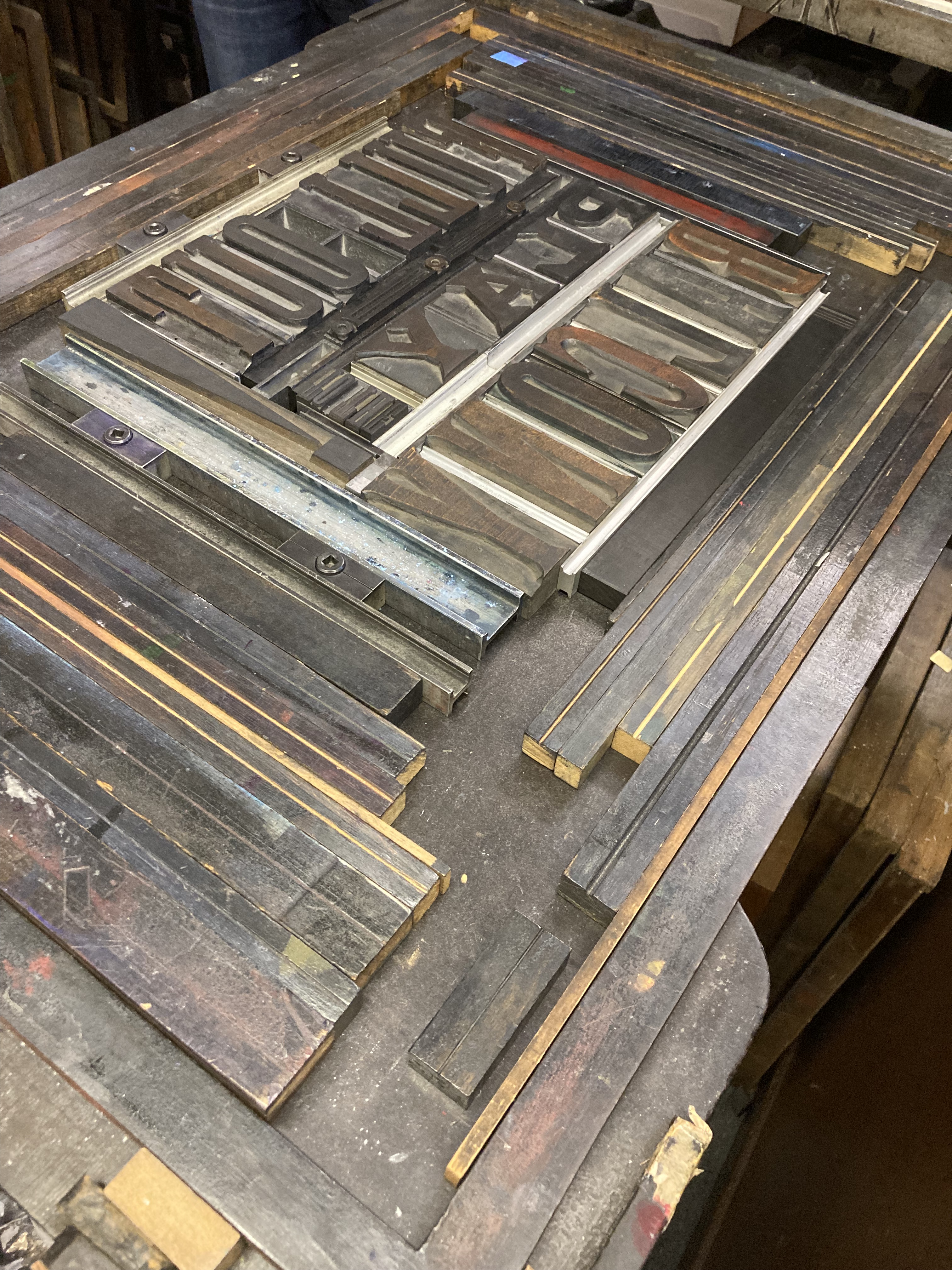
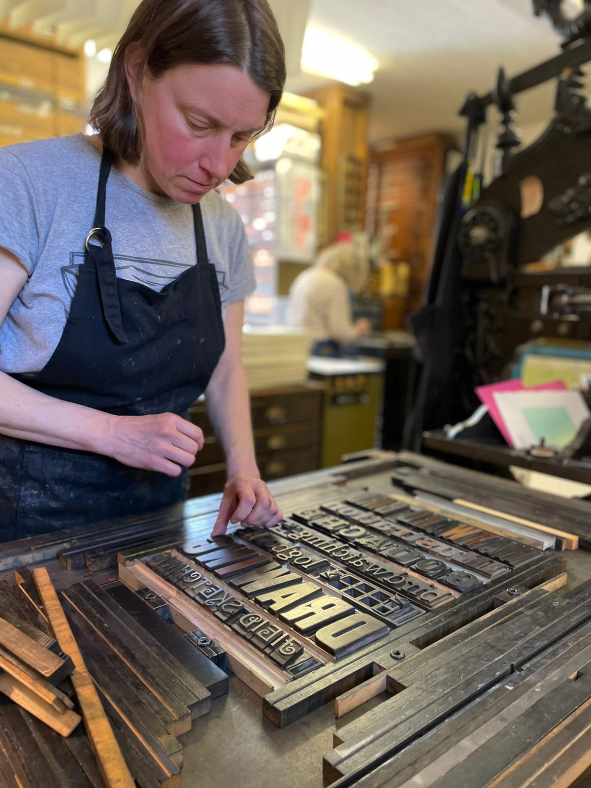
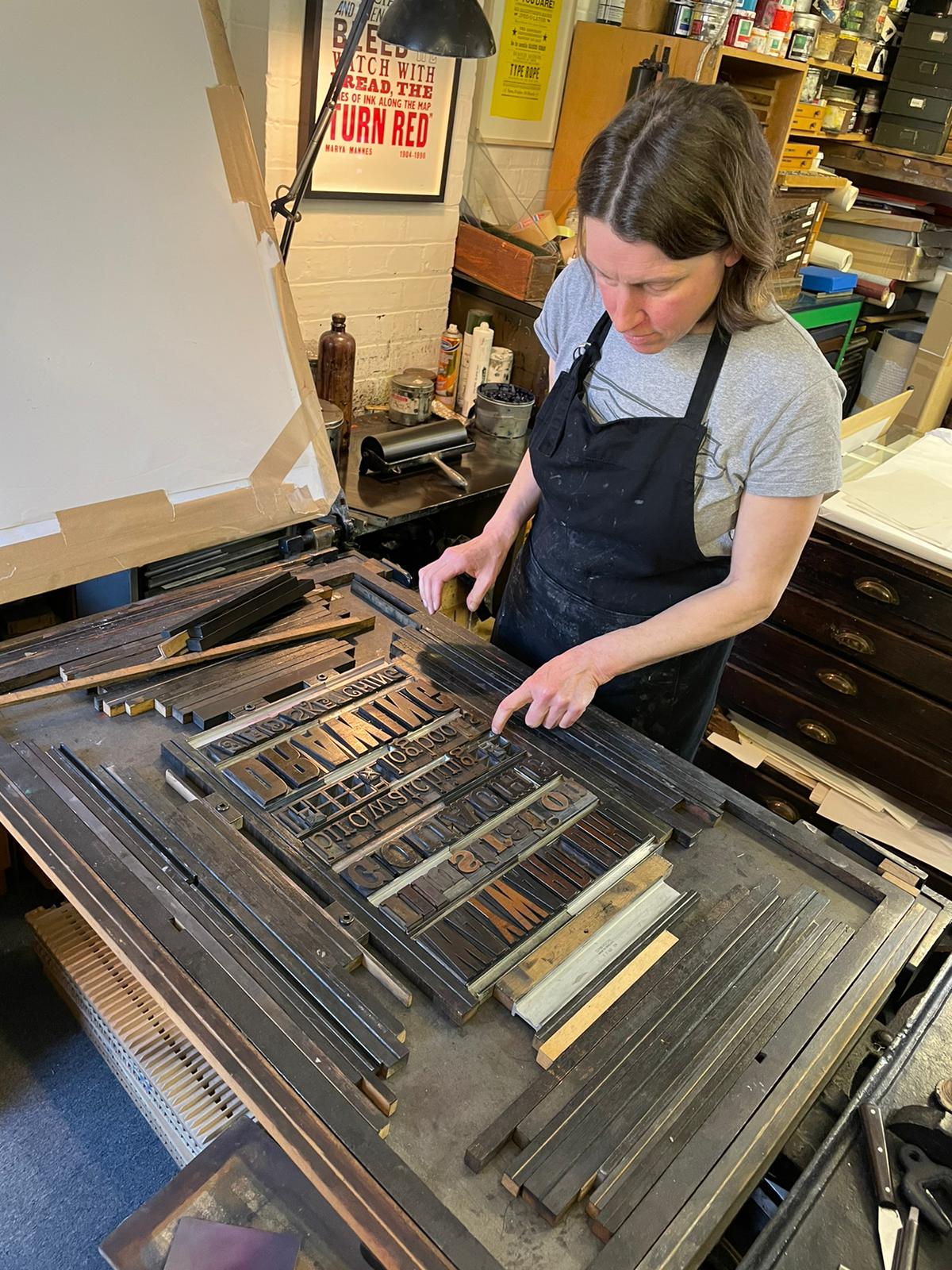
Then the moment of truth! I don’t know the names for the different parts of a printing press but the first one came out well enough to judge where we needed to alter the height of the letters that weren’t printing, or my patchy inking of the plate. Paper and thin card inserted underneath any slightly low letters raised them up the necessary thousandths of an inch to allow the ink to coat them. Another print taken, directly on to the newspaper, and this time adjusting how the paper related to the letters: using paper to press more firmly on those areas that were too light, and removing a layer where it was too heavy:
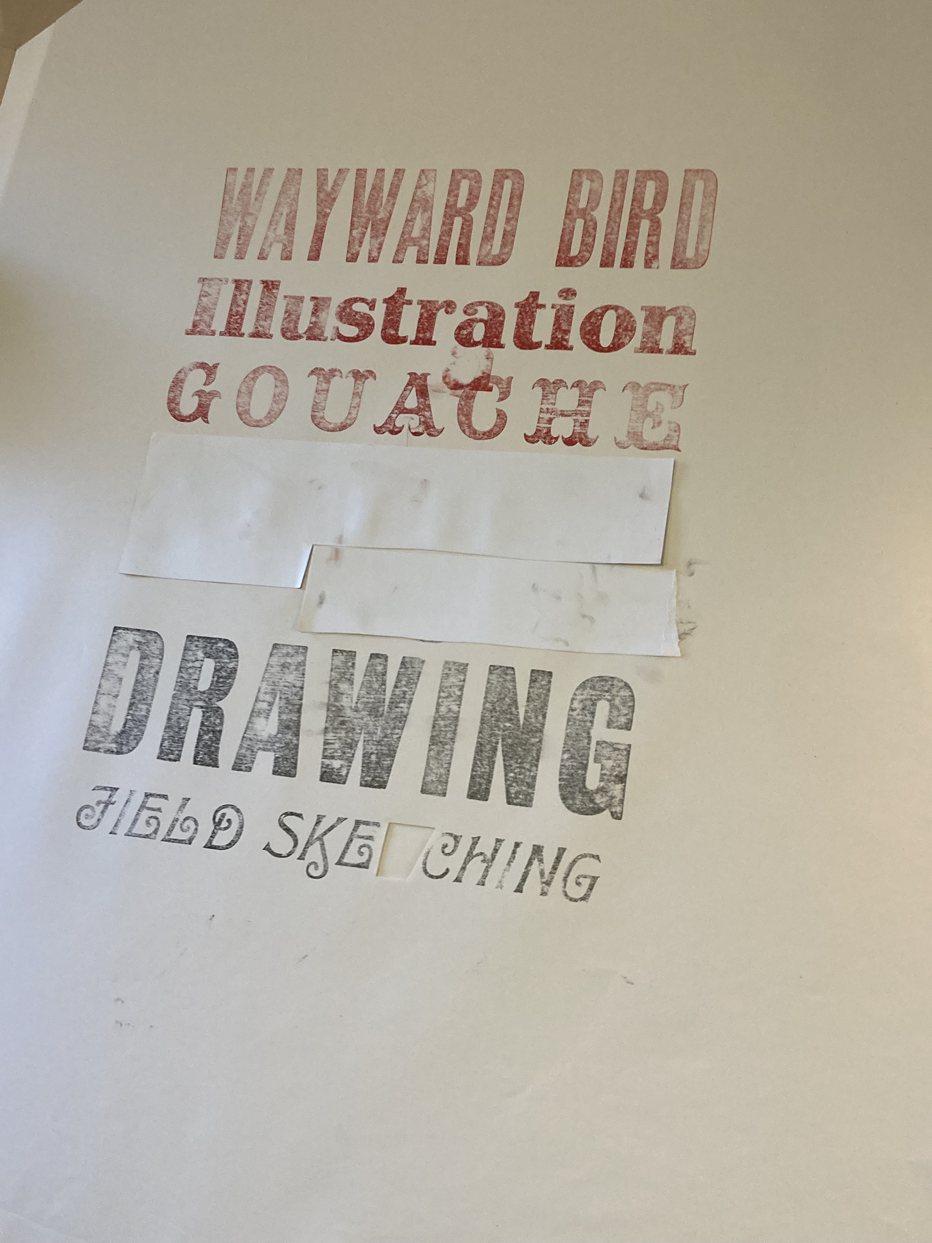
It was fascinating to watch Klara expertly cut and paste to allow the press to print correctly; all so physical and analogue – I loved it.
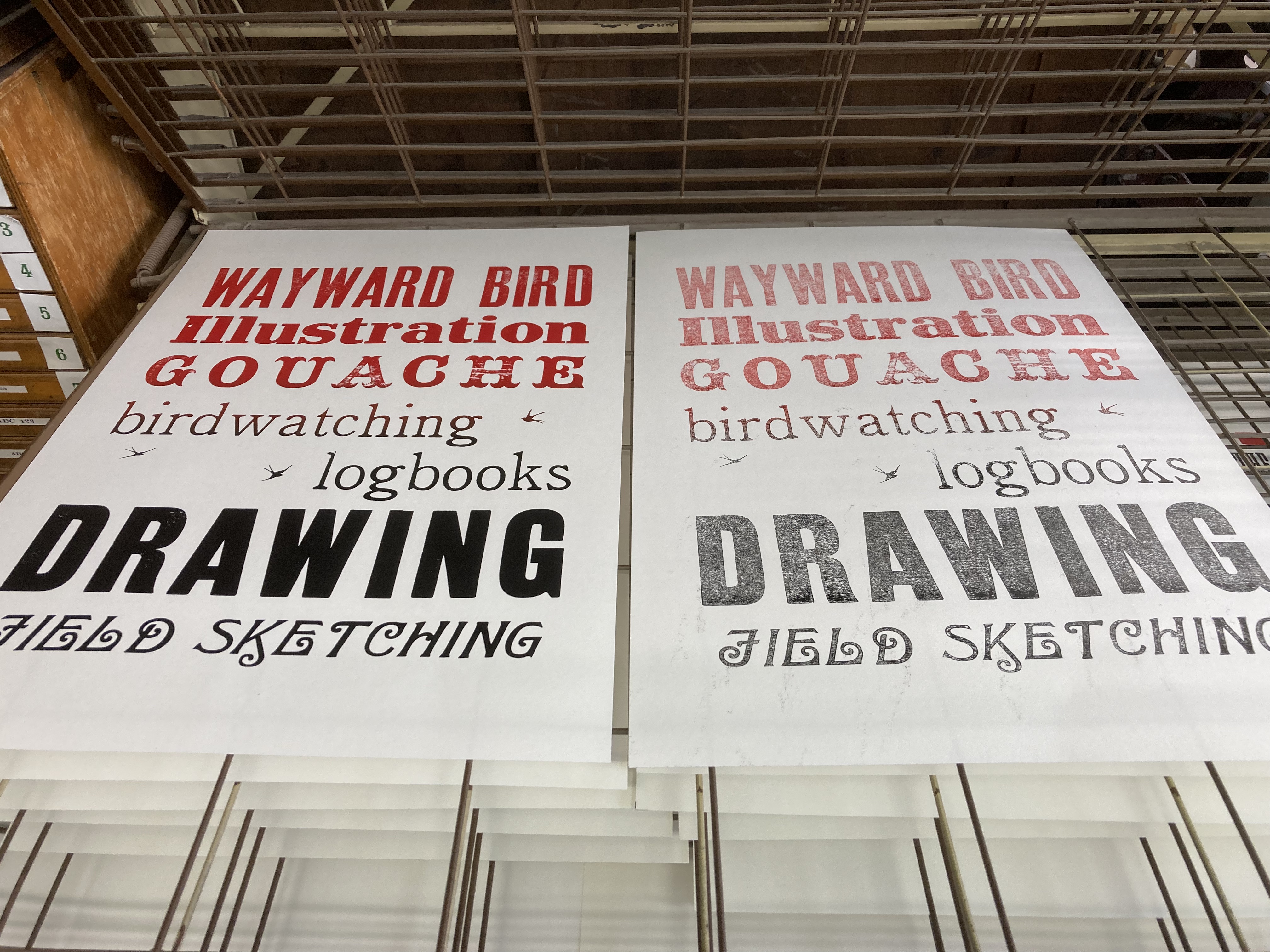
Here is a finished print with its ghost print:
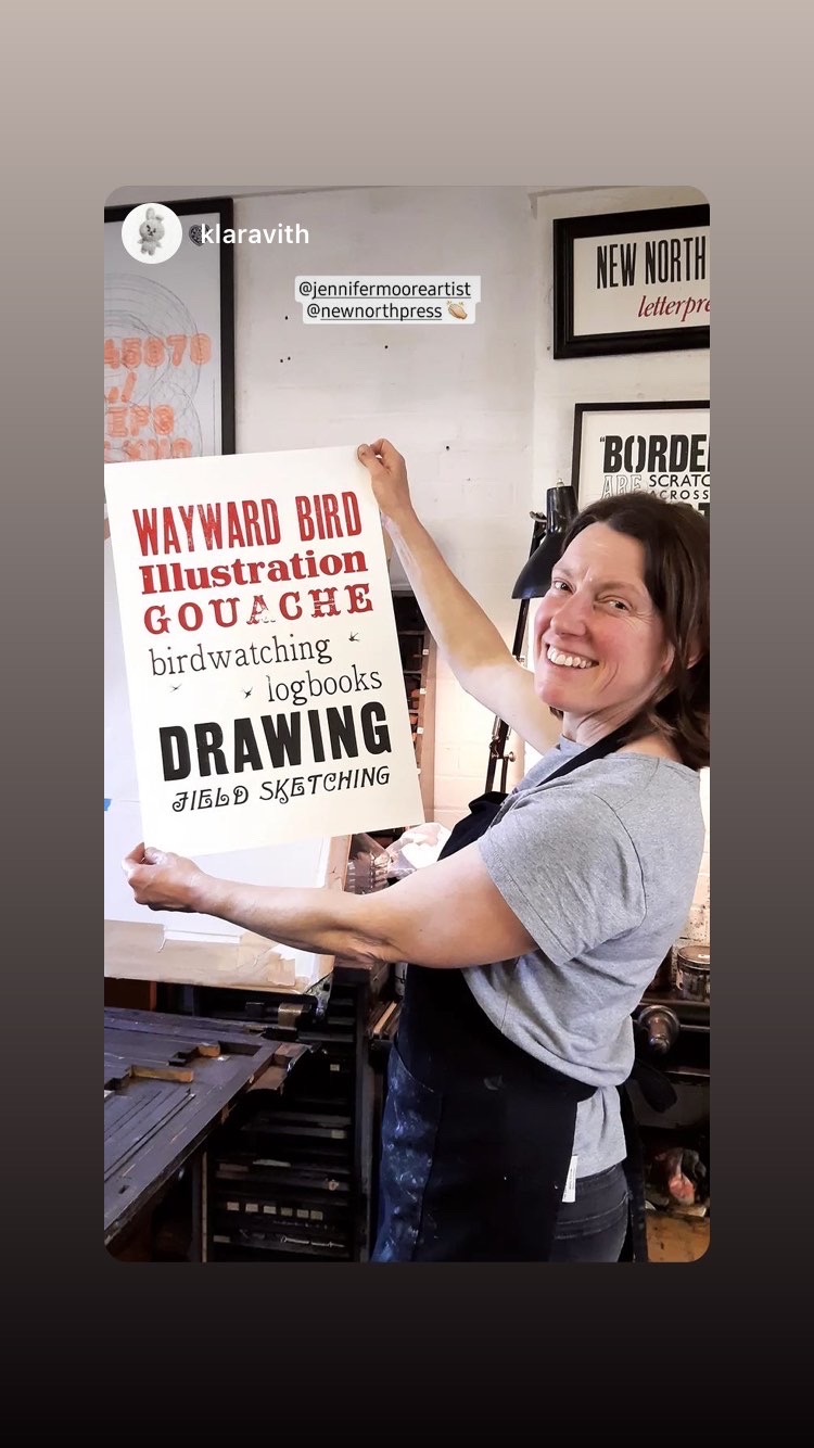
It was a brilliant day, and I can’t wait to go back and make another poster!


How wonderful! Would love to do that one day. Fantastic!
LikeLiked by 1 person
It was really good – thoroughly recommended!
LikeLike