
I have been wanting to try some different art, and keep faffing about with what I want to paint, and how big I want to go, and what medium to use, so in order to quiet the constant and conflicting creative chatter, I went ahead and started a painting of an interior inspired by Charleston Farmhouse, where I am a volunteer.
I didn’t want to go too big, but I did want to use the whole page in paint as there is something very satisfying about covering the paper with colour. I buy the paper for the illustrations in full sheets, so I cut one into quarters, which makes each one a nice size of between A4 and A3.
I did some thumbnails in my sketchbook to think about what sort of scene, and went ahead without really planning any of the colours. In my sketchbook I don’t care at all, but when I use a sheet of paper, somehow it becomes more serious and I have to remind myself that it still doesn’t matter. I also wanted to use gouache, and try to keep to the colours straight out of the tube as I am hopeless at working out how much I need to give good coverage, so if I mix a colour and then need more, it’s often not the same shade at all; gouache dries a very differently from what’s on the palette!
Here is my painting:
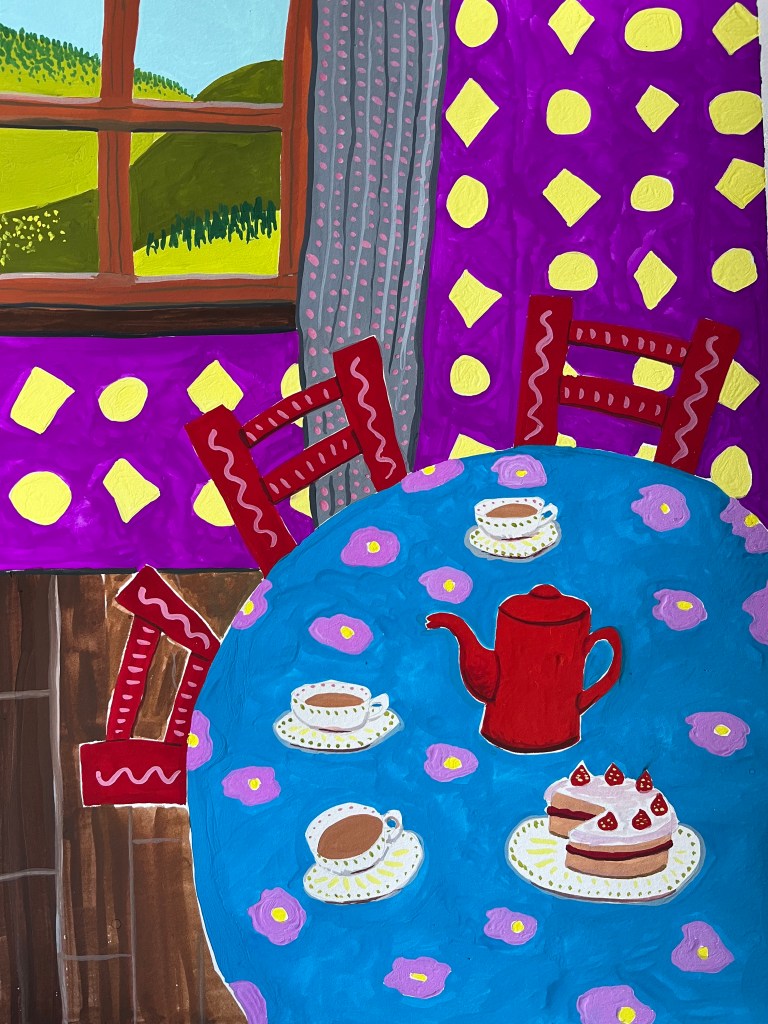
I realised the violet wallpaper makes the carmine chair disappear somewhat, and the blue looks patchy. To be honest, this paper is super smooth hot-pressed as I need that texture-free surface for scanning the illustrations, but it does mean the paint can sit on the surface more than it would with the dimples of a cold pressed paper.
It was lots of fun to do though, and it was nice working with a larger format.

