
I have a Substack for my volunteering at Charleston Farmhouse (so that I don’t clog up my blog here with non-art stuff) but I don’t especially enjoy it as a platform. The great thing about WordPress is that I can log on here and don’t have to go through a sort of gateway of other people’s stuff in order to get to my dashboard. I realise that Substack is there to promote writers and it’s antisocial of me to want to skip straight to Go without engaging with everyone else’s brilliant prose, but well, I cba as my children would say. On WordPress, I like the blogs I subscribe to, and often go to the Explore tab on the Reader section to find new people, but I like it to be my choice.
Anyway, one of the posts on Substack on my homepage which annoyingly caught my eye was one from a book editor or designer or someone and it was titled “How I can tell your Book is Self-Published”. As a self-publisher, I am always curious about the view of SP books from retailers and regular publishing folk, and it is genuinely important that I am aware of how my titles compete with the rest of the books on the shelves. Needless to say, I am always reassured that my books do NOT fall in to any of the “Worst Mistakes” section, but I have no formal training as a designer at all, let alone a book designer, nor do I have any professional editing experience. I am therefore very proud of the attention to detail, the overall concept, and the quality of the product with my birdwatching logbooks [insert warm glow of pride here]. One place I can’t hope to match the big boys however, is with the promo and point-of-sale (POS) material. Until now…
I’ve been updating the books to make them look a bit more contemporary and work a bit more coherently in a display* but in the meantime I wanted to make something I could give to retailers to provide a bit of focus in all the noise of a shop. Hence my need for the little bird PNGs to use without a background – fun though it was to play around with putting storks on my son’s head and dotting them around the Strasbourg buildings (see previous post). The logbooks sell best when sitting in a little stand, but they are quite small, and although I am rejigging the front cover to be brighter and more eye-catching, they still need a metaphorical megaphone to get people to buy them. I wanted to make something that would be suitable for any title, and also encourage retailers to use a stand, or at least prop them up in a shelf so that the booklets are front-facing.
Now, dear reader, you’ll have to bear with, as I didn’t want to make an ink-juicy printout until I was sure I had the proportions of the design organised correctly, as even when I am working in centimetres not pixels, and I have a ruler on InDesign, I still can’t work out how something will look unless I actually have the physical thing in front of me to play with and alter manually.
Anyway, here is the design:

I printed it out in draft, then stuck it onto some card, so this is the idea:

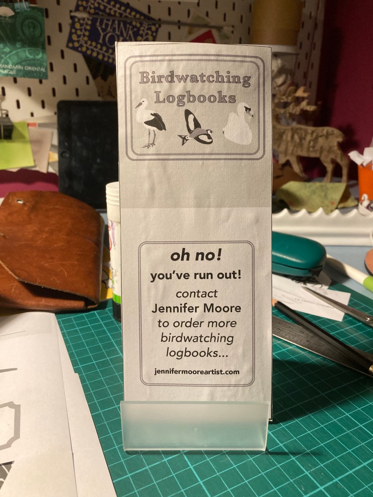
I’ve ordered some 180gsm white recycled card which should go through the printer, and I can then run some off in glorious technicolour and use a corner clipper to give a rounded edge. They will cost pennies to make, so I can give them out gratis with orders, and if I attach a piece of double-sided tape to the back, the retailer can affix the card to their stand. I’m going to have a think to see if there are any other dimensions I could use with the same design to cover more bases for POS. I absolutely love this sort of task.
*What’s that? You want to see the new logbooks? Ok – in the next post, promise…


1 Comment