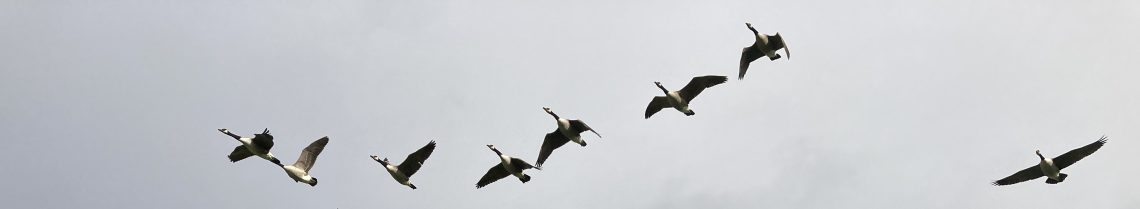
I have been trying to broaden my portfolio recently while keeping on the theme of birds and wildlife. My paintings of birds have always played with white space, and creating blocks of colour for the plumage, and in some ways replicating a lot of the graphic simplicity of a screenprint or linocut. This has always served very well for the birdwatching logbooks, as the paintings are greatly reduced in size to fit into the inch-diameter circles in the booklets so the simplification is necessary and charming.
I’d like to increase my scope with illustration so I have been practising painting trees, following this excellent tutorial on YouTube. As ever, I struggle with the dual incentives of following the rules and making things look realistic, and veering off the tracks to experiment and make things my own.
Here are my efforts from the tutorial creating daylight, moonlight, and dawn sunrise trees, and also my own take on autumn foliage:

I like painting the trunks, but realise the trees then need a sufficiently large canopy in relation to the size of the trunk, otherwise they look like broccoli.
I think trees might end up being a new thing for me. I spent a happy time on the train sketching from some photos of massive oaks I’d taken while on a dog walk:

Less is definitely more with trees, and the beauty of drawing over photos is that you can pick and choose the details you leave in and those which will make the drawing cluttered.
I had an idea to paint some moonlit trees (I love inky black paint) with Barn Owls, and try doing a proper illustration. I found some owl images online, and created a nighttime backdrop for them:
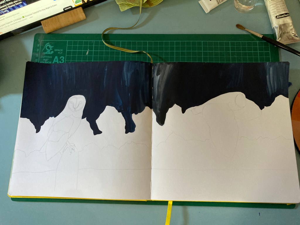
My Leuchtturm sketchbook has quite smooth, fine paper which I love, but it does make the paint quite streaky, although again, I love the texture and marks so I’m not interested in making it perfect.
I had great fun with the trees, and I’m pleased with how it turned out. I think in my mind, the owls would have been paler to make them contrast more, but in fact Barn Owls are really quite highly coloured, and I got a bit engrossed in the plumage. I was also concerned to achieve some aerial perspective with the trees, and make them look moonlit rather than snowy. I think it looks pretty good:

I was just about to say that I probably need to spend more time refining it, but to be honest, I like the gestural approach, and I do find the photorealistic gouache paintings I see on many accounts rather contrived, and I know for a fact that I will overwork the paint as I’m too impatient. What I enjoy is the physical act of applying paint to paper, and having the chance to use lots of indigo is just dreamy, and this shows in the final piece.
I bought some new blue and yellow paint while in London as I am trying to make my own greens so I would like to try a daylight scene next…

