
This took me most of the day, but I’m pleased with the result as it’s very different from what I normally do, and it is definitely something I’m going to continue working on over the next month or so.
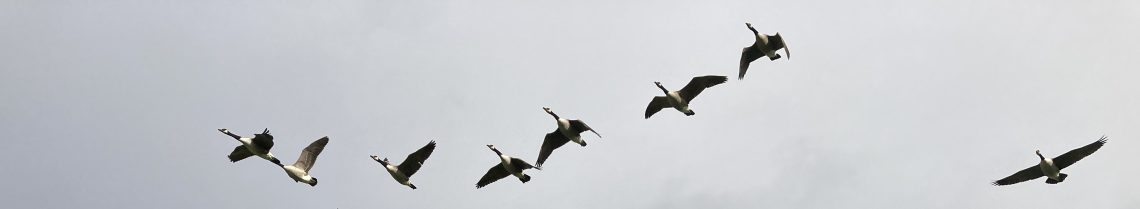
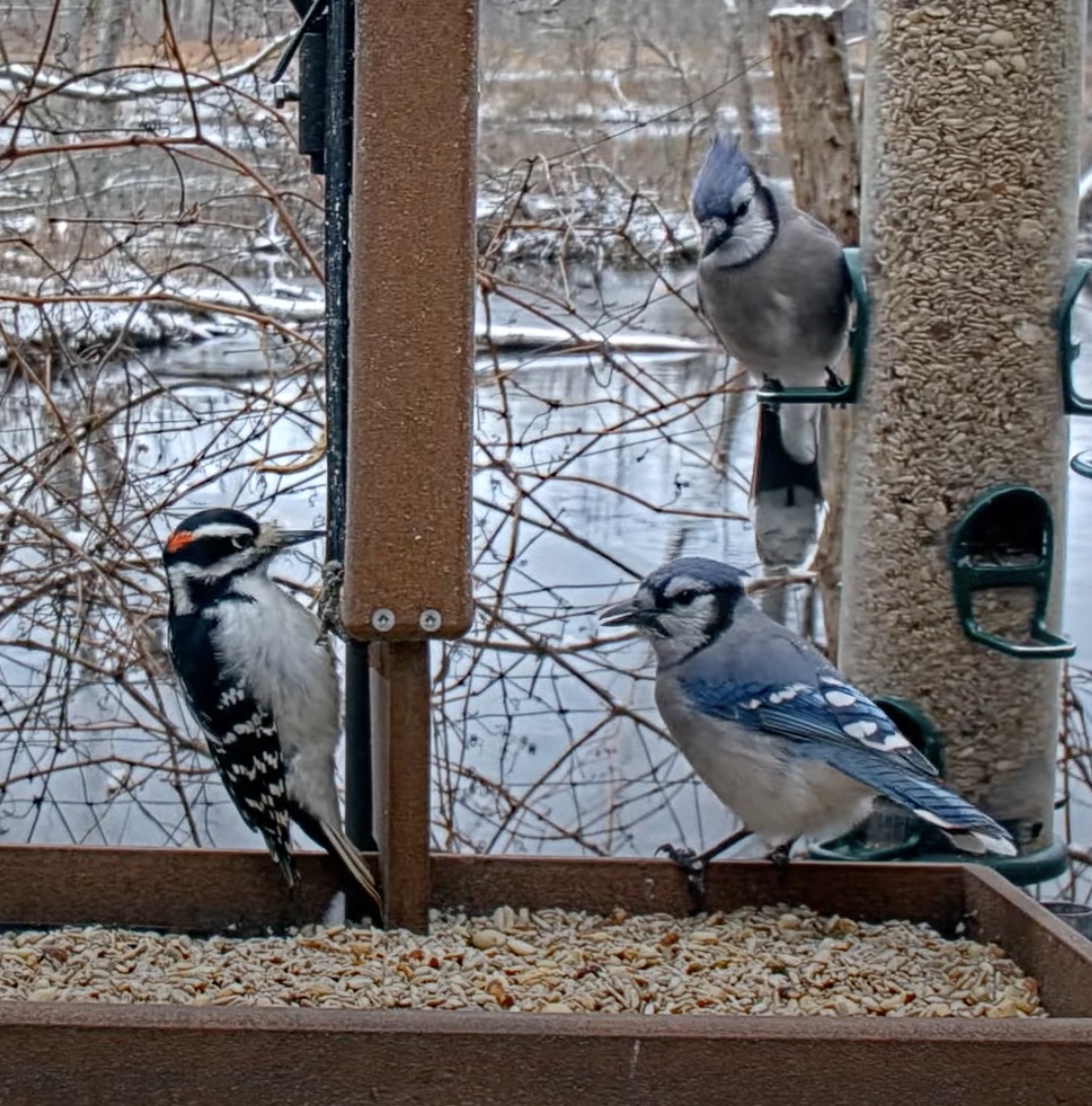
Having tried a few landscapes and watched various artists on YouTube, I was casting about for some inspiration for references images, and decided to try doing some birdscapes. I took some screenshots from the Cornell Lab feedercam so I could switch between the two while the gouache was drying.

With my logbook illustrations, I divide the bird up in to blocks of plumage – the more defined and uniform the better. This is why birds like Goldfinches, Mandarin Ducks, Puffins and Oystercatchers work so well, and birds like Curlew, Mistle Thrushes, Yellowhammers and Dunnocks are more tricky. I paint on to white paper and leave any white plumage free of paint. No shading, not too much detail as it won’t show up when the size is reduced in the book, and I try and convey as much information about the character of the bird as well. I use the gouache with a buttery consistency to give a standard flat finish for each of the plumage blocks.
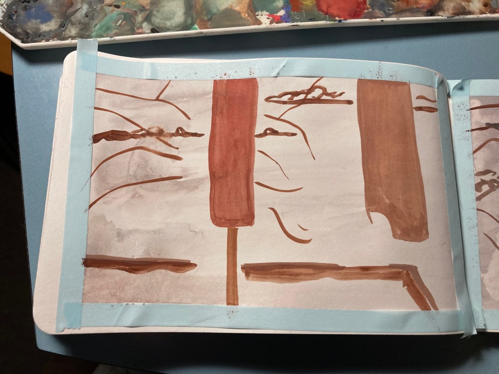
With this type of painting, it’s about layering, detail, shading, and utilising the properties of gouache as a medium. Also, there is a background, and more than one bird to contend with.
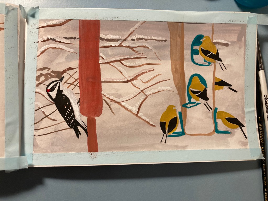
I made a lot of mistakes with these two paintings. I painted the whole of the page in white-based gouache, meaning it muddied all the layers on top. I also didn’t draw in any structures or birds first, so I didn’t leave any plain paper, and I got the proportions and positioning a bit wrong but it’s my sketchbook and the whole point is to experiment.
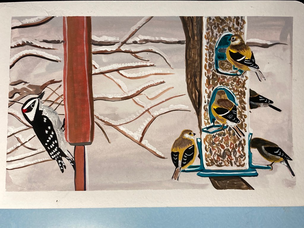
Here is the first one with the American Goldfinches:


And the Blue Jays. I didn’t take as many progress pictures with this one, but as you can see, I did change the colour of the background which works better.